16 november 2022

it's not about reinvention. it's quite the opposite, actually. it's about clearing away everything that is not mine.

in some ways it feels like all those years ago, when the body felt like nothing, like it would move away with the winterwinds;

i went for walks and everything was realer than i was. i was not invisible but i wasn't real. 

it does not feel like that now. it feels like i was so heavily buried by so much onzin, nonsense. i couldn't get away from it. until something had to move, away away because i couldn't anymore.

(i don't care about visibility.
but i am not invisible. that is not real. 

i wish to be more real.)

*

my thinking feels restricted. i don't know how to change it.
i'm too literal, can't get away from the surface. i think it's my own fault; it's my own fault, for moving away from the things that move me.

going in circles.

why not take my love and hold it.
why not try to get to the center of the love. i care so much about certain things but have not yet found a way to make that care more real in the day-to-day.
it's not just my thinking that feels (/ is?) restricted. 


maybe it's this never-empty horizon. i miss the higher spaces i am so familiar with. the depths of visibility. the air moving on and on and on and i'm not there to witness it, it all.

een oud liedje. te veel zijn. bang te veel te zijn. het probleem te zijn. dé reden dat dingen fout gaan, slecht aflopen. de reden dat anderen stress hebben.

& de dagen zijn zo ontzettend gevuld. drie dagen van twaalf uur verdeeld over een week & dan de dagen tussendoor nodig zijn om die andere drie dagen uit je lijf te krijgen.

dingen willen doen en dan die dagen te vol maken maar dan met de stille dingen waardoor je weer het idee hebt dat je niet genoeg doet want ----


i'm so fucking done with this.

finally sitting down to write & then being interrupted

and i just can't let myself be pissed off


see how i switched to another language. not my language. but definitely a language that is not theirs, either.

i don't want to have to talk.

i'm so tired of people.

and i can't say no

11 september 2022

i think i have mentioned this before: that i think landscape is "my" subject. 

it's something i'm very interested in right now. it's something that is always interesting to me, actually. this realisation feels important, because i've always been obsessed by that idea that one should have a style, a favourite medium, etcetera.

and i'm impressionable.
i'm working on it.

maybe my interests are a bit boring and oldfashioned. look at what i'm doing right now; mostly *just* value studies with colored pencils (i adore the sepia and burnt sienna and burnt ochre and brown ochre luminance-pencils: there are three of each, a light a middle and a dark) & sometimes an oil pastel landscape. 


this one was inspired by a landscape by the artist j. francis murphy; a november morning (1913). he was a tonalist. i'm really interested in that movement right now. it's mostly landscapes without humans (well, murphy's painting seems to contain a few tiny persons but i ignored them) & colours are subdued because the scenes depicted take place around sunset. they're very dusky and dark & i love them. 

that means the colours might also be boring to some, but i'm in love.
i would like to try to match the colours in the actual painting. warmer greens & some browns. and i definitely need more practice on skies. i also do not like the treeline.
i do like the fuzzy feeling of the colored pencil-study. where trees end and the sky begins. 

(do we really know where trees end and skies begin, ever?)

it's actually one of the things that attracted me most about tonalism: the presence of trees and the way they often are so gorgeously, almost abstractly, placed within wide and open landscapes. those landscapes are the ones i love most of all: faraway horizons, fields, solitary trees.

(i really really wanted to buy myself a book about tonalism called a history of american tonalism 1880-1920 by david a. cleveland. it is very, very expensive. & then my parents offered to help me out so now i own a copy... it's beautiful.)

*

i guess what i meant to say is that it feels good to kind of have a specific area of interest.

nine/ ten

oh, i knew this was going to happen.
i grew bored of my own challenge. 

so today, when i went out, i took a sketchbook & some pencils and neocolors with me and drew without any pre-conception. not even the landscape-thing was on my mind. 

i actually visited a place where i go often. it's a small meadow right next to a little bit of woodland. the meadow is quite wild, i think there was one cut late in the spring & since then it was left alone. it is rather dry, but that doesn't stop most farmers in this area from mowing their grasslands. i don't know whose it is but i'm grateful to them; it's beautiful.

the only thing that was on my mind was the wind i heard, the racing clouds & changing light, and the colours in my box. just a few. i particularly love the chromium oxide green & desert rose (it used to be called "flesh" but they've reconsidered the name, it seems; it's no. 42). moss green. payne's grey. and holbein's mustard pencil.

i put some shapes together. i enjoyed myself.

(i wish someone could just tell me how to do this, this thing called making
no -- i wish i had a better mindset.)

payne's gray i did not use. it was too blue. i could've used a darker version of the oxide green neocolor; i think i will add derwent lightfast's olive green to this selection of colours, tomorrow. and maybe seaweed. & a darker blueish green. neocolor's malachite, or dark green.

(i like neocolors but their colour range isn't perfect: i find it way too bright and happy. if only derwent made something similar to neocolor with their lightfast pencil-colours: they're so wonderful & earthy -- i wish i could combine the two, they would complement each other perfectly. if only.)


eight/ ten

i think some interesting things happened; i used some new colours. & a few other things -- my mind is too tired to find the proper words.

plus i'm cranky because blogger keeps messing with my images. i can't get the colours right, i don't know what i'm doing wrong. there's more green on my actual sketchbook-pages, and more depth. the landscapes look so very flat on these pictures.

well, maybe they just are. flat.

the first drawing is tiny; the size of a matchstickbox. it's the one i did first & i think i like it best (even though you can't tell that there's different kinds of trees in the picture. the second drawing is less of a mess in that area). the second one is interesting (to me anyway) because i started with a layer, a thin layer, of a brown ochre-ish colour and then used all kinds of greens (& ash grey in the sky) on top of that. i thought that gave it a bit more life and depth. but i'm not so sure about that anymore. i will look at them with (hopefully) fresh eyes tomorrow. 
i again do not like the foregrounds. i don't know what i want with them. maybe cut the big area in front of the trees off & give more space to the trees. i do like trees.

maybe i will go out tomorrow, find my own bunch of trees to draw. 

i do live in a beautiful area. lots of trees and heather fields. 
lots of pine trees.
i love pine trees.
i'll make pictures.

i also want to find a way, pay more attention to that area where the trees seem to dissolve into air. when i look at trees i never know where they really end, where the sky actually begins. i want softer edges. no edges. especially when the light is low, like it is right now, the interaction between air and tree can't be translated by any kind of distinctive edge.

(oh, the pictures are bad, i really don't want to share these. i'll just keep them very small, maybe they look better when they're very small.)

(and yes i was again inspired by a painting of charles warren eaton.
i try to keep them far away -- to keep them tiny, so i only see value and shape. that helped today. then again, i really like what is happening in the background. the subtle areas where there's light shining through trees, or where there's a tiny hint of another colour because there's still some disappearing light left.)

seven/ ten

 i’ve been trying to get back to that feeling in first two eaton-studies i did (from these two posts: 23 august and 24 august) but it’s not going very well. i think maybe the value studies contain too much detail still. when i look at the first few value studies i did, there was less stuff. nothing to really distract me from the stuff that actually matters: value and shape.

that is all there’s to it. so where do i distract myself, and why? it’s not like charles warren eaton was a realist. the details are suggestions: they aren’t actually there.

something to keep in mind for tomorrow’s drawings.

today i did a value study that i thought wasn’t good enough (it might just be too complicated a painting for me; it's the one called moonlight at the canal in bruges), so i didn’t do a drawing of that study; i took yesterday’s sketches & did another drawing of that particular landscape, a little bigger. it’s a bit boring. i don’t like the foreground. but i did learn something from today’s effort, i think.


six/ ten

yes, charles warren eaton again. i love the grittiness of his paintings — and i love that he painted so many pine trees: i love pine trees. i did not manage to make my trees look like pine trees today. they’re too tight, the entire drawing is. it’s like i wanted to make this drawing in the same way i did yesterdays’s — 


i wish i would/ could stop doing that: i’ve not done enough work to be able to understand what element i liked and why it’s working. not when it comes to oil pastels, anyway. i do like the depth of the dark colours, it's not very clear in this image because the evening light took me by surprise. days are getting shorter. i might add a better picture to tomorrow's post.

one of these days i will spend some more time: i will make more drawings with the oil pastels, more versions of the same value study. 

i really like oils. the textures. the depth of colour; especially the more transparent colours (sennelier) are fascinating. 

five/ ten

another day, another charles warren eaton-copy/ sketch.

a value sketch first -- well, three of them actually, but the first two were rubbish. i'm fine with that; it's a warming up-thing, i think. also, the first two value sketches were done with other media. watercolor and... something else. it did not work for me. an inktense pencil and watersoluble graphite pencil do work for me.

after that my own version of eaton's landscape. 
(my version looks nothing like eaton's painting but i don't think i care.)

i found a picture of his painting on a website, over here; i can't figure out what it's called. so odd when art websites just plop in pictures of artworks without giving any credit. i've spend some time on pinterest and google pictures but i could not find it. title unknown. sorry, charles.

(27 august: found it! it’s called the strip of pines (1908). appropriate.)


i spend a long time on the sketches & then started the oil pastel drawing and got cranky because in the beginning it's always a mess & i was tired and thankfully had to take care of diner. i then watered the plants in the greenhouse (it's so warm these days, they need and deserve it). i returned, just got in there, and finished the page (right on time; just before the orange light returned). 

sometimes taking a break really helps.

(i then went outside for a bit and the clouds were doing all kinds of weird things. lovely soft things.)

*

maybe i should not have listened to a podcast while doing my own work.

i was listening to sandi hester's episode (part two) on the sneaky art podcast & i adore her, her work is gorgeous and free and i really like to hear her talk about her creative process -- but i think i was comparing notes. which, of course, is ridiculous because every person has her own way and it's even more ridiculous because i'm still figuring things out for myself.

anyway, i paused the episode & put some music in my ears. i was still cranky but at least i got some pastel on paper.

and now it's time for tea & a movie; mrs lowry and son, recommended to me (and every other reader of her blog) by luisa

four/ ten

i did something else entirely, today, & i'm quite excited by it. it's nothing special. actually, it's something quite common & when you take any class, any decent class that is, for beginners, they will mention this: value. i decided to jump into it. i was never any good at it & never really wanted to. 

i don't know what changed but all of a sudden it's very interesting to me. so i picked out a painting by some pretty wonderful artist, charles warren eaton's september moonrise 1900, & just started.

first i tried some watersoluble graphite pencils; then luminance pencils; then regular graphite pencils -- i ended up with an inktense pencil for my dark, a watersoluble graphite pencil as my medium, and.... i can't remember, something else as my light. i've seen people use a white charcoal pencil to bring the light back, i might try that if i ever buy a white charcoal (or pastel) pencil.
i'm also thinking about buying a kraftpaper-sketchbook; that way you already have your medium colour which might be interesting.


i almost immediately panicked once i started the drawing of the landscape (his landscape) with my oil pastels. apparently something in me thought i had to re-produce the work. & i definitely did not, i even forgot to include the moon. 

thankfully i understood what was happening & could move past the panic. at the moment i quite like the drawing. i'm definitely doing this again. this feels important.

*

so, my new sennelier colours:


yes i put tape over the one colour i didn't like. it's the mummy colour. i will probably never use that one.


three/ ten

lately i've been drawing at the end of the day, because there's stuff to do in the morning & i like to sit outside and read in the afternoon. however, because my room faces west, the evening light streams in when i sit down to draw. and that does not help with colour. today was sunnier than the last couple of days were & i had to stop drawing because i couldn't see the colours anymore, i had no idea what i was doing. & that was while doing the second landscape.

when the light got really bad i just stopped. i might work on it some more, tomorrow, but i'm not sure. maybe i'll just abandon it.


i already did feel like i messed up the second one before the light turned orange, but i usually find a way to make the awfulness a little less awful -- i think it's partly to do with the sky; it's too cold & doesn't seem to correspond with the land. i know skies never are green but i'm not a realistic painter, drawperson, human being anyway. maybe i should do something with that. a greenish or maybe brownish sky. 

(i'm pretty sure there's a bit of green in the sky of the first landscape. accidentally there, but maybe that is why that sky is ok. the sky in the second one is also quite terribly because it's overworked.)

there's a bit in the second landscape that i do like: that soft smushy bit just below that dark tree-line.

i got my new oil pastels! i forgot to order some colours; i always do. i wanted some umbers & a dark grey but apparently i forgot to order them... i will post a photo with the colours soon. i used some for these landscapes; a buff titanium, some warmer greens & few greys. a light grey that is not at all light. and a colour called mummy that is basically mars violet by derwent drawing. not my colour. i thought it'd be browner but it's not. 

two/ ten

today everything’s a mess. i knew this was going to happen, because it often does when i’m like this. it’s my own fault for looking too often at the reference picture and also just messing around with the whole process.


i’m not sure how i did the ones i do like. i sometimes draw a few lines with a pencil, top bottom horizon line & the darker bits. did i do that yesterday? i think i did with the second one. then go to oil pastels: start at the top and go down.

i was thinking too much, because i just didn’t know where to start this time. do i use bigblocks of colour & then add the little details? do i start with darks or lights? i’m pretty sure i've also done the pencil lines-thing with a light colour oil pastel; ash grey or cream or silver grey. the first few drawings, but after that, i can’t remember.

i think i’m looking too much at the bits that are made up of many tiny bits, where earlier i squeezed my eyes and looked for the larger areas. i’m not sure. definitely thinking too much.


something that did make me happy, today, was finding out about american tonalism. entirely my thing, at the moment & maybe longer. i feel lots of study coming, the good kind, the kind being fuelled by curiosity.

day one/ ten

today’s work. i have a headache so this will be a short blogpost.


i don't like the first one; i didn't use the right colours & that is where the mess started. i do like the second one; possibly because it’s softer and definitely because it’s not overworked like the first one.

i ignored drawing the path in the first few drawings because i felt i did not have the right colours, but i’m starting to like their absence.

something else i’ve noticed: reference pictures are really helping me to start the drawing — i have to learn when to stop looking at them. that is why the first one feels like a mess. 

thanks to flowerville for the lovely reference photographs.

i’ll be back tomorrow.

19 augustus 2022

i'm thinking about maybe a week of daily posts, possibly longer (ten days). starting tomorrow, i think.

i bought some new sketchbooks & a few new oil pastels and i'm loving doing landscapes with the pastels, so that might be what i'm chasing, this coming week. it's quite possible it will turn into something else (whenever i'm sure i know something, that knowing turns itself against me), and that's fine. we will see.

the pastels i've ordered are sennelier pastels. it seems my taste in art materials is quite expensive, which i hate, but the feel-part of making has always been important to me. i'm not talking about the psychological feeling but the actual touch of hand and materials and (/on) paper-feeling; & i really love the way sennelier pastels feel. & some colours are transparent, which make them so interesting. and the colours themselves also are superior, i feel, to any other brand. (their white is shiny though; horrifying.)

i will share pictures of the colours i ordered when they get here; monday, i think.

*


a friend of mine recently spend some time near the english coast (she lives in the uk) & send me many photographs of her surroundings at the time; i've been using them as reference. (she's also a blogger: flowerville -- she's lovely.)

with these landscapes i actually did use quite a few neopastels so i guess i do like some of them: ash grey, khaki green, and cream (that one i really like, must get some more of that colour). and their white isn't shiny so that's good. one of the mungyo gallery pastels is also a favourite; olive. i hope to find a sennelier one that looks alike, since you can't get mungyo's open stock, and neopastel's olive looks nothing like it.

augustus 2022

i wish i was better at sharing my process.
i wish i knew more about my creative process.
i wish i didn't find them so important, all those things.

i'm reading martin gayford's newest david hockney-book & it is wonderful. but it is also confusing me enormously.


yesterday i did some drawings influenced by reading the hockney-book. his line drawings (the ones inspired by van gogh's drawings). i was definitely going to draw again, today, because i loved doing them, so i went looking for pictures to use for reference. 

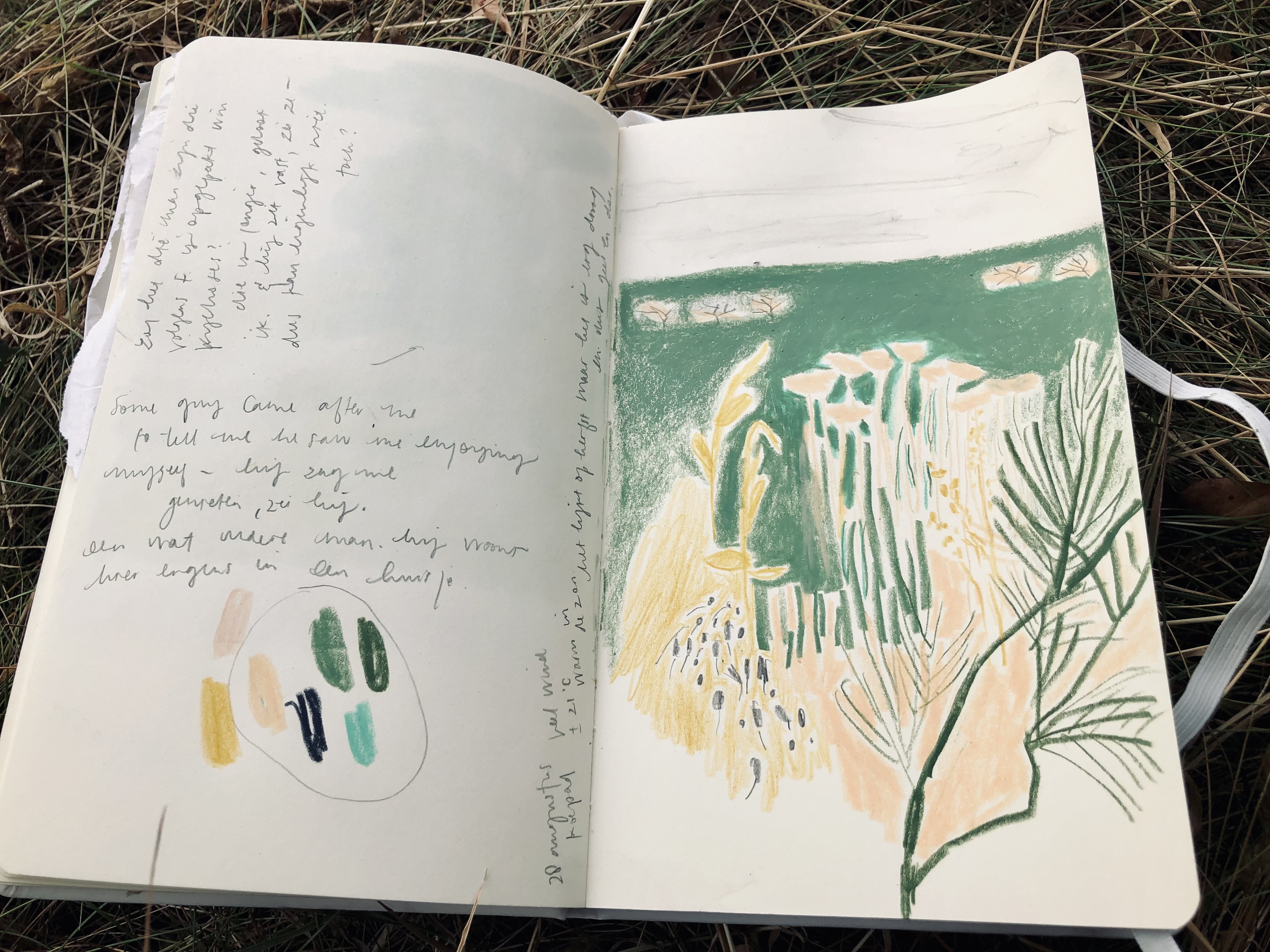
and then i ended up taking out my oil pastels & ended up doing a tiny landscape with them.


i wish i... i wish i had the one medium i loved & wanted to properly explore. it feels like i'm constantly jumping around, and i don't know why --

said i; while also knowing i am not at all a planner, not a long term-thinker, & i definitely do not have any other reason to draw than... joy.

which is why i'm loving the hockney-book so much because he seems to embody that philosophy; that making art should be joyful.

martin gayford writes:

Hockney (..) believes that pleasure is a requirement for art. He deplores the puritanical attitude of the art world to enjoyment (..).

DH: I was in San Francisco once, and a curator said to me that he hated Renoir. I was shocked by that. I said, ‘What word would you use to describe your feelings for Hitler then?’ Poor old Renoir. He hadn't done anything terrible: he'd painted some pictures that pleased a lot of people. It's awful to say you hate him for doing it!

*

a tiny voice inside my head did say to do some more work with oil pastels, recently. last week, i think. my issue usually is colour & i'm really trying to deal with that, to work with that. i was thinking i could do colour studies; look at work by artists i admire, maybe do some master-studies. i was particularly thinking about monet's landscapes, and van goghs trees. i was going to fill a sketchbook with oil-pastel-landscapes & line explorations. and then i fell asleep & abandoned the plan, it seems.

line was my obsession for the last few days, it started before i began reading the hockney-book & the book has enhanced the interest. i was ready to order new sketchbooks, in fact i just ordered some, and a new ecoline colour (deep green) -- & then i received a message that the sketchbooks are not in stock at the moment, if maybe i can wait.

these problems are tiny but they tire me out. (it doesn't help that it's been too hot for about a week now; temperatures over thirty degrees celsius. my body does not cope.)

anyway. here's a picture of my oil pastels:


*

i actually figured the thing out, the drawing or oil pastels thing: i can do both. i can actually do both. i can do whatever the fuck i want. so i will do both.

or i could try drawing with oil pastels. 

24 april 2022


a drawing i did today of a poppy’s head. it’s from many years ago
but it still holds seed. i will put them in the earth, 
sometime soon.

i read poetry by linda gregg.

the light is astonishing, in the evening.
like all kinds of blessings. or maybe just one.
(i don’t know which one, nor any of the other ones.)
it is evening.

linda gregg, ‘the defeated’ (from her book too
bright to see
)


tea time.


10 april 2022

i'm done with thinking i know anything. this is what happened today:


quiet notes/ sketches

(quiet notes on process)

i guess i shall call these sketches. 
i think i like line and form. and i like white space --
& blue, i'm finally able to do things with blue. my obession with greens helped with that, somehow. or maybe it's just that i'm not throwing every other colour together with the ones i actually like. why is/ was it so hard for me to just not do that?

because i see everyone else use all the colours & it's easy to copy.

the one reason why i'm trying to step away from instagram. i don't want any other influence on the things that come out of me other than the stuff i take in entirely voluntarily. this feels so important at the moment;

lots of poetry. lucille clifton, rutger kopland, paul celan, ada limón, linda gregg.


the darkness we see between the stars is very old. a drawing can cast blackness (il jette du noir) into the soul of him who contemplates it.

christopher neve, in his piece about sheila fell in the book unquiet landscapes.

//

elsewhere